Preface
Goal: Awesome theming in modularized configuration.
Awesome support theming:
-
Simple Border
-
Native Gap
-
Element Color: Task, Tag, Menu
-
Titlebar Icon
-
Layout Icon
We are going to do this in modularized way.
For these to works we also need to utilize some inkscape to generate icons.
Table of Content
Theme Artefacts
The layout of a theme is free. It is actuallly up to you to manage.
Here below I refactor the the theme into five lua artefacts.
$  tree clone
clone
├── elements.lua
├── gmc.lua
├── layouts.lua
├── theme.lua
└── titlebar.lua

0 directories, 5 files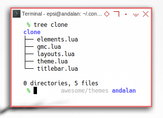
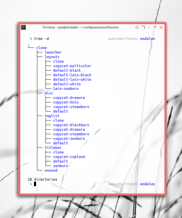
Resources
How about resources?
Here below I put each resource, such as icon or image, in its own respective directory.
$  % tree -d
.
└── clone
    ├── launcher
    ├── layouts
    │   └── clone
    ├── misc
    │   └── default
    ├── taglist
    │   └── clone
    └── titlebar
        └── clone
Furthermore I also put resources, from other theme as well, so you can switch easily. Or at least easier for you to compare my resources to other example.
The complete resources in tree fashioned view is as below:
Bold Border and Huge Gaps.
I personally do not use huge gaps and bold border on daily basis. It is just wasting up spaces. There are also time that I do not even like titlebar.
If you find my current theme setting irritating, you might be right. It is not just a matter of taste. But rather exploration of what AwesomeWM can do. and you can always configure it as you like later.
Transparency
I use external tool called compton, and now picom.
This is beyond Awesome WM explanation.
Calling Script
We are going to call these scripts in themes/clone/theme.lua.
-- default variables

theme = {}

dofile(theme_path .. "elements.lua")
dofile(theme_path .. "titlebar.lua")
dofile(theme_path .. "layouts.lua")
dofile(theme_path .. "icons.lua")
And call the deco/titlebar.lua script in theme later.
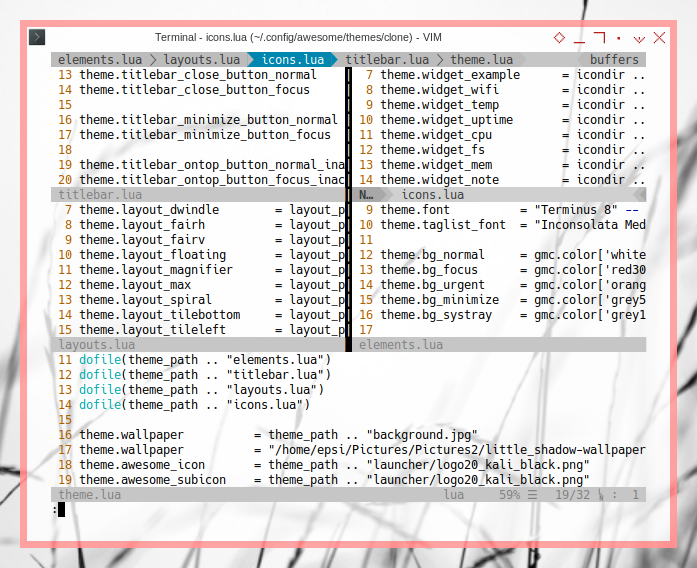
Do not get intimidated with codes above. They all are just a bunch of properties setting.
1: Main Theme Configuration
local awful = require("awful")
awful.util = require("awful.util")

theme_path = awful.util.getdir("config") .. "/themes/clone/"

-- default variables

theme = {}

dofile(theme_path .. "elements.lua")
dofile(theme_path .. "titlebar.lua")
dofile(theme_path .. "layouts.lua")

theme.wallpaper          = theme_path .. "background.jpg"
theme.awesome_icon       = theme_path .. "launcher/logo20_kali_black.png"
theme.awesome_subicon    = theme_path .. "launcher/logo20_kali_black.png"

return theme
Sub configuration
To avoid complexity, I separate setting in separate file,
e.g elements.lua, titlebar.lua, and layouts.lua`.
All variables in that file will be bound to theme variable.
Changing Variables
You may change the variable such as below:
theme.wallpaper = "/home/epsi/Pictures/Pictures2/little_shadow-wallpaper-1280x800.jpg"Launcher Icon
You can choose any icon for the launcher. I just, simply like the Kali logo, even though I’m using Gentoo. It is going to be shown on the left widgets.
  -- Add widgets to the wibox
  s.mywibox:setup {
    layout = wibox.layout.align.horizontal,
    { -- Left widgets
      layout = wibox.layout.fixed.horizontal,
      RC.launcher,
      s.mytaglist,
      s.mypromptbox,
    },
    ...
  }
2: Google Material Color
Before we step into theming, we need pallete as a based of our colorscheme.
My choice is Google Material Color.
This is the gmc.lua.
local _M = {}

-- Associative Array (Hash)

_M.color = {
    ['white'] = '#ffffff',
    ['black'] = '#000000',

    ['grey50']  = '#fafafa',
    ...
    ['grey900'] = '#212121',

    ['red50']   = '#ffebee',
    ...
    ['redA700'] = '#d50000',

    ['pink50']   = '#fce4ec',
   ...
    ['pinkA700'] = '#c51162',

    ['blue50']   = '#e3f2fd',
    ...
}

return _M
You might prefer different pallete_._
Reference
3: Elements
This is where the most of the theme setting configured. Most of it just setting the color.
Module Dependency
Pretty straightforward.
local gmc = require("themes.clone.gmc")

local theme_assets = require("beautiful.theme_assets")
local xresources = require("beautiful.xresources")
local dpi = xresources.apply_dpi
Font
There are only two fonts.
theme.font          = "Terminus 8" -- "Tamsyn 10" -- "Sans 8"
theme.taglist_font  = "Inconsolata Medium 9"
Here is the beauty of Lua,
I can put alternative setting as comments.
I mean, if I’m bored with Terminus, I can switch to Tamsyn,
by changing the code.
Gap
Awesome 4.x series come with native gaps. No need external library.
theme.useless_gap = dpi(20)You can omit the dpi by write this as below
theme.useless_gap = 20And I always think, 20 is too big for daily basis.
This is just an example.
Border
theme.border_width  = dpi(7)

theme.border_normal = gmc.color['blue500']
theme.border_focus  = gmc.color['red300']
theme.border_marked = gmc.color['orange500']
Here, instead of hardcoding the color to something,
such as theme.border_normal = '#2196f3'.
We can refer to material pallete such as blue500.
And yeah, I also think, 7 is too big for daily basis.
This is just an example.
Tag List
It is self explanatory here.
theme.bg_normal     = gmc.color['white']     .. "cc"
theme.bg_focus      = gmc.color['red300']    .. "cc"
theme.bg_urgent     = gmc.color['orange900'] .. "cc"
theme.bg_minimize   = gmc.color['grey500']   .. "cc"
theme.bg_systray    = gmc.color['grey100']   .. "cc"

theme.fg_normal     = gmc.color['black']
theme.fg_focus      = gmc.color['white']
theme.fg_urgent     = gmc.color['white']
theme.fg_minimize   = gmc.color['white']

theme.taglist_bg_focus = gmc.color['red500'] .. "cc"
theme.taglist_fg_focus = gmc.color['white']
You can directly add alpha transparency cc.
So the blue500 .. cc is equivalent to #2196f3cc.

As an alternative, you might consider to use image instead of just color.
theme.taglist_bg_focus = "png:" .. theme_path .. "misc/copycat-holo/taglist_bg_focus.png"Tag List Square
In default awesome you can use this configuration setting below:
-- Generate taglist squares:
local taglist_square_size = dpi(4)
theme.taglist_squares_sel = theme_assets.taglist_squares_sel(
    taglist_square_size, gmc.color['black']
)
theme.taglist_squares_unsel = theme_assets.taglist_squares_unsel(
    taglist_square_size, gmc.color['white']
)
But I prefer the oldschool image.
theme.taglist_squares_sel      = theme_path .. "taglist/clone/square_sel.png"
theme.taglist_squares_unsel    = theme_path .. "taglist/clone/square_unsel.png"
SVG Source
I have made my own custom SVG source:

You might want to alter the image yourself to suit your needs, such as switch color or else.
SVG source available at:
Task List
There is not much to say about task list
theme.tasklist_bg_normal = gmc.color['white']    .. "88"
theme.tasklist_bg_focus  = gmc.color['red300']   .. "88"
theme.tasklist_fg_focus  = gmc.color['black']
Alternatively.
theme.tasklist_bg_normal = "png:" .. theme_path .. "misc/copycat-holo/bg_focus.png"
theme.tasklist_bg_focus  = "png:" .. theme_path .. "misc/copycat-holo/bg_focus_noline.png"
Title Bar
Title bar in here is only set the color.
theme.titlebar_bg_normal = gmc.color['white']   .. "cc"
theme.titlebar_bg_focus  = gmc.color['white']   .. "cc"
theme.titlebar_fg_focus  = gmc.color['black']   .. "cc"
We will deal with the icon in other artefacts.
Menu
This menu is also self explanatory.
theme.menu_submenu_icon  = theme_path .. "misc/default/submenu.png"

theme.menu_height = 20      -- dpi(15)
theme.menu_width  = 180     -- dpi(100)
--theme.menu_context_height = 20

theme.menu_bg_normal = gmc.color['white']  .. "cc"
theme.menu_bg_focus  = gmc.color['red300'] .. "cc"
theme.menu_fg_focus  = gmc.color['black']

theme.menu_border_color = gmc.color['blue500'] .. "cc"
theme.menu_border_width = 1
Complete
As a asummary, here is the complete code.
local gmc = require("themes.clone.gmc")

local theme_assets = require("beautiful.theme_assets")
local xresources = require("beautiful.xresources")
local dpi = xresources.apply_dpi

-- -- -- -- -- -- -- -- -- -- -- -- -- -- -- -- -- -- -- -- -- -- -- --

theme.font          = "Terminus 8" -- "Tamsyn 10" -- "Sans 8"
theme.taglist_font  = "Inconsolata Medium 9"

theme.bg_normal     = gmc.color['white']     .. "cc"
theme.bg_focus      = gmc.color['red300']    .. "cc"
theme.bg_urgent     = gmc.color['orange900'] .. "cc"
theme.bg_minimize   = gmc.color['grey500']   .. "cc"
theme.bg_systray    = gmc.color['grey100']   .. "cc"

theme.fg_normal     = gmc.color['black']
theme.fg_focus      = gmc.color['white']
theme.fg_urgent     = gmc.color['white']
theme.fg_minimize   = gmc.color['white']

theme.useless_gap   = dpi(10)
theme.border_width  = dpi(3)

theme.border_normal = gmc.color['blue500']
theme.border_focus  = gmc.color['red300']
theme.border_marked = gmc.color['orange500']

-- There are other variable sets
-- overriding the default one when
-- defined, the sets are:
-- taglist_[bg|fg]_[focus|urgent|occupied|empty]
-- tasklist_[bg|fg]_[focus|urgent]
-- titlebar_[bg|fg]_[normal|focus]
-- tooltip_[font|opacity|fg_color|bg_color|border_width|border_color]
-- mouse_finder_[color|timeout|animate_timeout|radius|factor]
-- Example:

theme.taglist_bg_focus = gmc.color['red500'] .. "cc"
--theme.taglist_bg_focus = "png:" .. theme_path .. "misc/copycat-holo/taglist_bg_focus.png"
theme.taglist_fg_focus = gmc.color['white']


theme.tasklist_bg_normal = gmc.color['white']    .. "88"
--theme.tasklist_bg_normal = "png:" .. theme_path .. "misc/copycat-holo/bg_focus.png"
theme.tasklist_bg_focus  = gmc.color['red300']   .. "88"
--theme.tasklist_bg_focus  = "png:" .. theme_path .. "misc/copycat-holo/bg_focus_noline.png"
theme.tasklist_fg_focus  = gmc.color['black']

theme.titlebar_bg_normal = gmc.color['white']   .. "cc"
theme.titlebar_bg_focus  = gmc.color['white']   .. "cc"
theme.titlebar_fg_focus  = gmc.color['black']   .. "cc"

-- Generate taglist squares:
local taglist_square_size = dpi(4)
theme.taglist_squares_sel = theme_assets.taglist_squares_sel(
    taglist_square_size, gmc.color['black']
)
theme.taglist_squares_unsel = theme_assets.taglist_squares_unsel(
    taglist_square_size, gmc.color['white']
)

-- Display the taglist squares

-- override
theme.taglist_squares_sel      = theme_path .. "taglist/clone/square_sel.png"
theme.taglist_squares_unsel    = theme_path .. "taglist/clone/square_unsel.png"

-- alternate override
-- theme.taglist_squares_sel   = theme_path .. "taglist/copycat-blackburn/square_sel.png"
-- theme.taglist_squares_unsel = theme_path .. "taglist/copycat-blackburn/square_unsel.png"
-- theme.taglist_squares_sel   = theme_path .. "taglist/copycat-zenburn/squarefz.png"
-- theme.taglist_squares_unsel = theme_path .. "taglist/copycat-zenburn/squareza.png"


-- Variables set for theming the menu:
-- menu_[bg|fg]_[normal|focus]
-- menu_[border_color|border_width]
theme.menu_submenu_icon  = theme_path .. "misc/default/submenu.png"

theme.menu_height = 20      -- dpi(15)
theme.menu_width  = 180     -- dpi(100)
--theme.menu_context_height = 20

theme.menu_bg_normal = gmc.color['white']  .. "cc"
theme.menu_bg_focus  = gmc.color['red300'] .. "cc"
theme.menu_fg_focus  = gmc.color['black']

theme.menu_border_color = gmc.color['blue500'] .. "cc"
theme.menu_border_width = 1

-- You can add as many variables as
-- you wish and access them by using
-- beautiful.variable in your rc.lua
--theme.bg_widget = "#cc0000"
What is Next?
There is this topic, about custom flat design titlebar. Creating minimalist PNG Button using Inkscape, one SVG file to create each PNG resource.
Consider continue reading [ Awesome WM - Theme - Titlebar ].