Preface
Goal: Openbox Theme Multi Color Trick
We are going to use flatypuss theme.
A flat design theme, originally made for dotcats community.
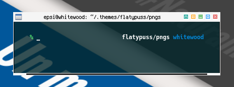
Table of Content
Note
Based On
This work, inspired by Block Theme from white cat.
As my admiration, and respect, to his excellent taste in design.
Despite that cool multicolor theme, I only add the button, and nothing else.
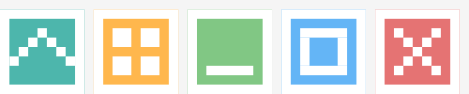
Reverse Color Button
In order to have these multicolor button, we must prepare a reverse color button. It means white foreground on black backround, instead of black foreground on white backround.
Coloring Button
Most theme’s color are in grey, except the button and menu. I would like to make the window color as neutral as possible.
In configuration, this is the basic stuff.
!! grey300 on white
window.active.button.unpressed.bg:          Solid Flat
window.active.button.unpressed.bg.color:    #ffffff
window.active.button.unpressed.image.color: #e0e0e0

window.active.button.shade.unpressed.image.color:   #4db6ac
window.active.button.desk.unpressed.image.color:    #ffb74d
window.active.button.iconify.unpressed.image.color: #81c784
window.active.button.max.unpressed.image.color:     #64b5f6
window.active.button.close.unpressed.image.color:   #e57373
But that’s not all. there is more to come in detail.
1: Unified Graphic Material
This is the Inkscape Part.
Instead of separated UI design for each icon, we can put all icons into one SVG file.
Inkscape Document
SVG source is available at:
Get the SVG
You may make from scratch or get my flatypuss.svg from my dotfiles repository at github.
Slices
Before you begin this the slices that we want to achieve. You might want to alter the UI/UGM image yourself to suit your needs.
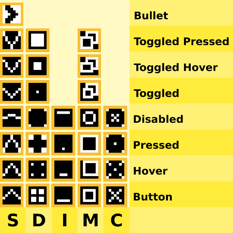
Both iconify and close do not have toggle counterpart.
Note that as an exception, the bullet utilize black foreground on white backround. Since it is a menu object, no need to reverse.
Layers
No need further explanation
I utilize the same layers with our previous matclue layers.
Button Size
We are using, only [W*H = 9px * 9px] button for this style. For each I also give an imaginary narrow border of 1px wide, in border layer.
Design by Pixel
The same reason with previous matclue theme
Building the XBM
The same method with previous matclue theme
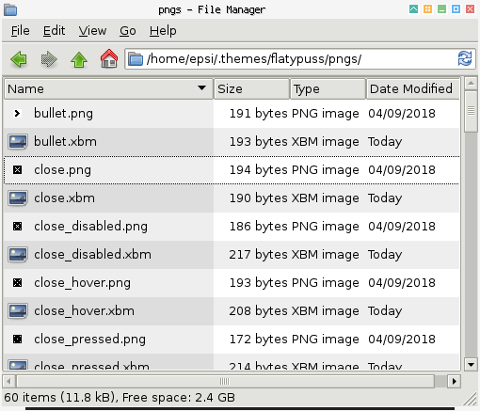
Exporting Button
The same method with previous matclue theme
Mogrify
The same method with previous matclue theme
Utilize mogrify to convert
each *.png to *.xbm
$ mogrify -format xbm *.png- .
2: Configuration
Window Geometry
The same config with previous matclue theme
Menu Geometry
Using black cat’s trick.
menu.border.width: 7
menu.overlap.x:    -14
menu.overlap.y:    0
Border Colors
Grey only
!! grey100
window.active.border.color:   #f5f5f5

!! grey500
window.inactive.border.color: #9e9e9e

!! grey100
menu.border.color:            #f5f5f5

!! grey100
window.active.client.color:   #f5f5f5

!! black
window.inactive.client.color: #000000
Text Shadows
The same config with previous matclue theme
Window Title justification
The same config with previous matclue theme
Not you might want to alter to your own taste.
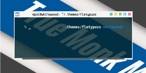
3: Active Window: Title and Label
Less is more
I would like to make it as simple as possible.
!! black on grey100
window.active.title.bg:         Solid Flat
window.active.title.bg.color:   #f5f5f5

window.active.label.bg:         Parentrelative
window.active.label.text.color: #000000
4: Active Window: Handle and Grip
Still grey.
!! grey900
window.active.handle.bg:        Solid Flat
window.active.handle.bg.color:  #212121

!! grey100
window.active.grip.bg:          Solid Flat
window.active.grip.bg.color:    #f5f5f5
5: Active Window: Base Button
All are parentrelative
!! grey300 on white
window.active.button.unpressed.bg:          Solid Flat
window.active.button.unpressed.bg.color:    #ffffff
window.active.button.unpressed.image.color: #e0e0e0

!! parentrelative: grey300 on white
window.active.button.hover.bg:              parentrelative
window.active.button.pressed.bg:            parentrelative
window.active.button.disabled.bg:           parentrelative
window.active.button.toggled.unpressed.bg:  parentrelative
window.active.button.toggled.pressed.bg:    parentrelative
window.active.button.toggled.hover.bg:      parentrelative
6: Active Window: Specific Button
Each button color, has gradation unumber form material color
!! teal: u:300, h:500, p:700, d:grey300, tu:300, th:500, tp: 700
window.active.button.shade.unpressed.image.color:   #4db6ac
window.active.button.shade.hover.image.color:       #009688
window.active.button.shade.pressed.image.color:     #00796b
window.active.button.shade.disabled.image.color:    #e0e0e0
window.active.button.shade.toggled.unpressed.image.color:   #4db6ac
window.active.button.shade.toggled.hover.image.color:       #009688
window.active.button.shade.toggled.pressed.image.color:     #00796b
For the rest, let me explain in term of material color.
-
shade: teal: u:300, h:500, p:700, d:grey300, tu:300, th:500, tp: 700
-
desk: orange: u:300, h:500, p:700, d:grey300, tu:300, th:500, tp: 700
-
iconify: green: u:300, h:500, p:700, d:grey300
-
max: blue: u:300, h:500, p:700, d:grey300, tu:300, th:500, tp: 700
-
close: red: u:300, h:500, p:700, d:grey300
Now you can understand how I made the color for each buttons.
Note that both iconify and close do not have toggle counterpart.
7: Active Window: Complete
And here is the result complete version of active window.
!! black on grey100
window.active.title.bg:         Solid Flat
window.active.title.bg.color:   #f5f5f5

window.active.label.bg:         Parentrelative
window.active.label.text.color: #000000

!! grey900
window.active.handle.bg:        Solid Flat
window.active.handle.bg.color:  #212121

!! grey100
window.active.grip.bg:          Solid Flat
window.active.grip.bg.color:    #f5f5f5

!! grey300 on white
window.active.button.unpressed.bg:          Solid Flat
window.active.button.unpressed.bg.color:    #ffffff
window.active.button.unpressed.image.color: #e0e0e0

!! parentrelative: grey300 on white
window.active.button.hover.bg:              parentrelative
window.active.button.pressed.bg:            parentrelative
window.active.button.disabled.bg:           parentrelative
window.active.button.toggled.unpressed.bg:  parentrelative
window.active.button.toggled.pressed.bg:    parentrelative
window.active.button.toggled.hover.bg:      parentrelative

!! teal: u:300, h:500, p:700, d:grey300, tu:300, th:500, tp: 700
window.active.button.shade.unpressed.image.color:   #4db6ac
window.active.button.shade.hover.image.color:       #009688
window.active.button.shade.pressed.image.color:     #00796b
window.active.button.shade.disabled.image.color:    #e0e0e0
window.active.button.shade.toggled.unpressed.image.color:   #4db6ac
window.active.button.shade.toggled.hover.image.color:       #009688
window.active.button.shade.toggled.pressed.image.color:     #00796b

!! orange: u:300, h:500, p:700, d:grey300, tu:300, th:500, tp: 700
window.active.button.desk.unpressed.image.color:    #ffb74d
window.active.button.desk.hover.image.color:        #ff9800
window.active.button.desk.pressed.image.color:      #f57c00
window.active.button.desk.disabled.image.color:     #e0e0e0
window.active.button.desk.toggled.unpressed.image.color:    #ffb74d
window.active.button.desk.toggled.hover.image.color:        #ff9800
window.active.button.desk.toggled.pressed.image.color:      #f57c00

!! green: u:300, h:500, p:700, d:grey300
window.active.button.iconify.unpressed.image.color: #81c784
window.active.button.iconify.hover.image.color:     #4caf50
window.active.button.iconify.pressed.image.color:   #388e3c
window.active.button.iconify.disabled.image.color:  #e0e0e0

!! blue: u:300, h:500, p:700, d:grey300, tu:300, th:500, tp: 700
window.active.button.max.unpressed.image.color:     #64b5f6
window.active.button.max.hover.image.color:         #2196f3
window.active.button.max.pressed.image.color:       #1976d2
window.active.button.max.disabled.image.color:      #e0e0e0
window.active.button.max.toggled.unpressed.image.color:     #64b5f6
window.active.button.max.toggled.hover.image.color:         #2196f3
window.active.button.max.toggled.pressed.image.color:       #1976d2

!! red: u:300, h:500, p:700, d:grey300
window.active.button.close.unpressed.image.color:   #e57373
window.active.button.close.hover.image.color:       #f44336
window.active.button.close.pressed.image.color:     #d32f2f
window.active.button.close.disabled.image.color:    #e0e0e0
I’m just dumping my config here.
8: Inactive Windows
Inactive window utilize uniform grey color.
!! grey500 on grey100
window.inactive.title.bg:         Solid Flat
window.inactive.title.bg.color:   #f5f5f5

window.inactive.label.bg:         Parentrelative
window.inactive.label.text.color: #e0e0e0

!! grey100
window.inactive.handle.bg:        Solid Flat
window.inactive.handle.bg.color:  #f5f5f5

!! grey900
window.inactive.grip.bg:          Solid Flat
window.inactive.grip.bg.color:    #212121

!! grey100 on grey300
window.inactive.button.unpressed.bg:                  Solid Flat
window.inactive.button.unpressed.bg.color:            #e0e0e0
window.inactive.button.unpressed.image.color:         #f5f5f5

!! grey100 on grey700
window.inactive.button.disabled.bg:                   Solid Flat
window.inactive.button.disabled.bg.color:             #616161
window.inactive.button.disabled.image.color:          #f5f5f5

!! grey100 on grey300
window.inactive.button.toggled.unpressed.bg:          Solid Flat
window.inactive.button.toggled.unpressed.bg.color:    #e0e0e0
window.inactive.button.toggled.unpressed.image.color: #f5f5f5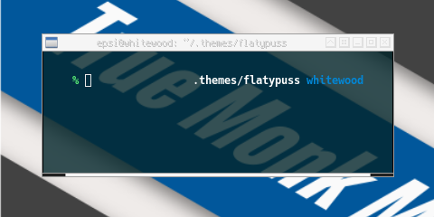
If you wish, you can also add colors for each inactive button.
!! teal: u:100
window.inactive.button.shade.unpressed.image.color:   #b2dfdb

!! orange: u:100
window.inactive.button.desk.unpressed.image.color:    #ffe0b2

!! green: u:100
window.inactive.button.iconify.unpressed.image.color: #c8e6c9

!! blue: u:100
window.inactive.button.max.unpressed.image.color:     #bbdefb

!! red: u:100
window.inactive.button.close.unpressed.image.color:   #ffcdd2
9: Menus
This should be self explanatory.
!! black on red100, with grey100
menu.title.bg: Solid Flat Border
menu.title.bg.color: #ffcdd2
menu.title.bg.border.color: #f5f5f5
menu.title.text.color: #000000
menu.title.text.justify: Center

!! grey700
menu.separator.color:           #616161
menu.separator.width:           3
menu.separator.padding.width:   6
menu.separator.padding.height:  3

!! black on grey100, except grey500
menu.items.bg:                  Solid Flat
menu.items.bg.color:            #f5f5f5
menu.items.text.color:          #000000
menu.items.disabled.text.color: #9e9e9e

!! white on red300, with grey500, except grey500
menu.items.active.bg:                  Solid Flat Border
menu.items.active.bg.color:            #e57373
menu.items.active.bg.border.color:     #9e9e9e
menu.items.active.text.color:          #ffffff
menu.items.active.disabled.text.color: #9e9e9e
10: Compositor: Shadow Menu
Before make the menu pretty with shadow, we need to adjust a bit, to get the effect
menu.border.width: 7
menu.overlap.x:    4
menu.overlap.y:    0
Now we need to adjust compositor in compton.conf.
# Shadow
shadow = true;
no-dnd-shadow = true;
no-dock-shadow = true;
clear-shadow = true;
shadow-radius = 7;
shadow-offset-x = -14;
shadow-offset-y = -7;
Consider also change the menu opacity in compton.conf.
# Opacity
menu-opacity = 0.9;
frame-opacity = 1;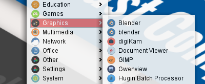
Conclusion
I think that’s all about theme.
I’m thinking of make another openbox article.