Preface
Goal: Reusable SVG, as a base for Fluxbox theme.
Table of Content
Note
I will go straight to Inkscape’s SVG, and discuss about the style configuration later.
This guidance applied for any linux distribution.
Previous Article
Most Inkscape related article has been discussed in previous XFWM4 article.
1: Unified Graphic Material
This is the Inkscape Part.
Instead of separated UI design for each icon, we can put all icons into one SVG file.
Inkscape Document
SVG source is available at:
Get the SVG
You may make from scratch or get my exilorate.svg from my dotfiles repository at github.
Slices
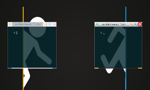
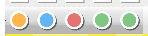
Before you begin this the slices that we want to achieve.
You might want to alter the UI/UGM image yourself to suit your needs.
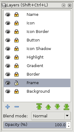
Layers
I utilize some more layers, we are going to build this step by step.
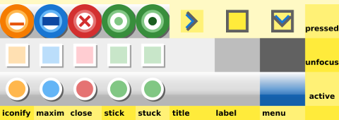
Button Size
We are using, only [W*H = 24px * 24px] button for this style. Some other image might have different width and height.
2: Building the XPM
This is also the Inkscape Part.
Since we are going to use XPM only.
Exporting Button
Hint: Use Inkscape’s Batch Export, to export all shapes at once.
Consider set these layers before export:
-
Locked: icon, icon border, button, icon shadow, highlight, gradient, border
-
Unlocked: Frame
-
Hide: name, background
Now the tricky part, for each border box parts.
We must select the box first in frame layer,
so we can have the export target filename such as close-active.png.
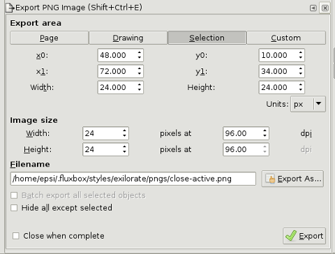
This is a tricky part.
For image with transparency, such as selected menu button,
We have to hide the frame layer, because we want empty space as transparent.
The next thing to do is to click the export button to export PNG.
Unhide the frame layer, to select other box.
Mogrify
Fluxbox is using XPM, while Inkscape export to PNG.
Hence, we should convert from PNG to XPM.
We can utilize mogrify to do this task.
$ mogrify -format xpm *.png- .
3: Gradient and Highlight
This is still the Inkscape Part.
Layer
I utilize some more layers, such as this two
-
gradient
-
highlight
Gradient Node
Remember that, the button has 24px height.
On gradient layer, below the icon layers:
I put a box, 24 px height, filled with gradient with four handles as shown above.
-
Handle 0: rgba = (0, 0, 0, 80)
-
Handle 1: rgba = (0, 0, 0, 48)
-
Handle 2: rgba = (0, 0, 0, 24)
-
Handle 3: rgba = (0, 0, 0, 64)
On highlight layer, over the top border: 8px vertical offset of the previous box
I put a box, 16 px height, filled with gradient with two handles.
-
Handle 0: rgba = (255, 255, 255, 255)
-
Handle 1: rgba = (255, 255, 255, 40)
Neither gradient or highlight on unfocused button. It is just simply flat.
Export
Now that we are done, we can export each PNG boxes.
4: Button
This is still also the Inkscape Part.
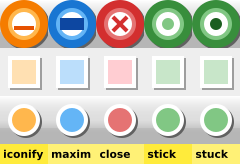
Specification
-
Size: W*H = 24px * 24px. Each box button has this size.
-
Colors: Using Google Material: Red, Green , Blue, Orange. Each box button has different color. Stick button and Stuck button, have the same color.
You may have different, to suit your needs.
Layout
We are going to make a uniform shape for each button.
Usability
The issue with minimalist color is that,
it is good in aestethic issue, but lack of functional aspect.
In order to solve this usability issue, I put functional icon on keypressed,
such as the x icon for close.
So that user won’t click the wrong button.
Details
There are four details, for each use the same spec as these below
-
Focused:
-
layer icon: circle of 12 px radius with red300 color
-
layer icon-border: circle of 16 px radius with white color

-
-
Unfocused:
-
layer icon: box of 12 px radius with red100 color
-
layer icon-border: box of 16 px radius with white color
-
-
Pressed, give an icon to solve usability issue.
-
layer icon: circle of 12 px radius with white color
-
layer icon-border: circle of 16 px radius with red300 color
-
layer button: cut circle of 24 px radius with red700 color
-
layer icon:
xshape with red900 color

-
What’s Next
This is only the Inkscape Part, Consider continue reading [ Theme: Style Part ]