Preface
Goal: Explaining Openbox Theme Configuration
After XFWM4 Theme and Fluxbox style, here comes my curiosity about Openbox Theme.
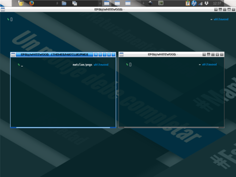
Table of Content
-
Preface: Table of Content
-
1: Color
-
5: Text Shadows
-
11: Inactive Windows
-
12: Menus
Note
Reading
Structure on this guidance based from example from this official resource.
Managing Configuration
Based on example configuration on official site, the Openbox config has these parts:
-
Window geometry
-
Menu geometry
-
Border colors
-
Text shadows
-
Window title justification
-
Active window
-
Inactive windows
-
Menus
This how this article arranged.
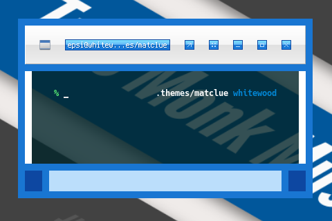
Where to put style configuration
Just in case you are new to fluxbox config, here we I put my style.
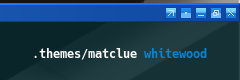
/home/epsi/.themes/matclue/openbox-3/
Configuration Source
themerc is available at:
1: Color
The difference with the original example is, I use comment to identify, material color that I use.
!! blue700
menu.border.color: #1976d2
Since the theme equipped with material pallete, changing color has become easier.
To change material color, just search and replace for the whole themerc document.
I provide a few themerc, for each color in themerc directory.
And here is the result:
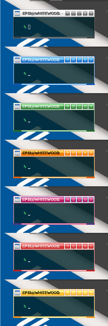
I originally name this theme as matblue,
but after I found a cheap way to get other colors,
I renamed it to matclue.
I have no clue why.
2: Configuration
Window Geometry
This should be self explanatory.
padding.width:  2
padding.height: 2
border.width:   1
window.client.padding.width:  1
window.client.padding.height:  0
window.handle.width: 3
But if you insist you can experiment with changing each size.
padding.width:  20
padding.height: 20
border.width:   10
window.client.padding.width:  10
window.client.padding.height:  0
window.handle.width: 30
And see the result:
I know it is weird, but with this figure, you will have a comprehensive understanding about the window geometry.
3: Menu Geometry
menu.border.width: 1
menu.overlap.x: 0
menu.overlap.y: 0
This is most common configuration, untouched from the example.
My friend, The black cat has a menu gaps configuration: noirecat/arc-ob-theme.. This tweak is aestethically very nice.
menu.border.width: 10
menu.overlap.x: -18
menu.overlap.y: 0
And set the menu.border.color
to be about the same as its menu.items.bg.color counterpart.
4: Border Colors
This also, should be self explanatory. You should see how I use material color in comment.
!! blue700
window.active.border.color: #1976d2

!! grey500
window.inactive.border.color: #9e9e9e

!! blue700
menu.border.color: #1976d2

!! white
window.active.client.color: #ffffff

!! black
window.inactive.client.color: #000000
5: Text Shadows
Mostly I only change the shadowtint,
either 20, or 70,
as show in official example configuration.
window.active.label.text.font: shadow=y:shadowtint=20:shadowoffset=1
window.inactive.label.text.font: shadow=y:shadowtint=20:shadowoffset=1
menu.items.font: shadow=n
menu.title.text.font: shadow=y:shadowtint=20:shadowoffset=1
6: Window Title justification
This also, should be self explanatory.
window.label.text.justify: Center7: Active Window: Title and Label
This is the main part.
Consider begin playing with this Flat Solid title,
and Parentrelative label.
!! white on blue300
window.active.title.bg: Flat Solid
window.active.title.bg.color: #64b5f6
window.active.label.text.color: #ffffff
window.active.label.bg: Parentrelative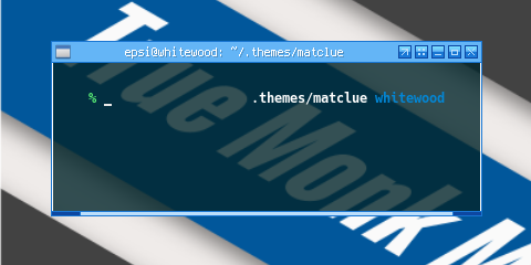
Consider playing with horizontal gradient.
!! white on blue300 to blue700, with blue900
window.active.title.bg: Raised Gradient Horizontal Border
window.active.title.bg.color: #64b5f6
window.active.title.bg.colorTo: #1976d2
window.active.title.bg.border.color: #0d47a1
window.active.label.text.color: #ffffff
window.active.label.bg: Parentrelative
And finally label box in title box.
!! window.active.label.bg: Parentrelative

!! white on grey100 to grey300
window.active.title.bg: Raised Gradient SplitVertical
window.active.title.bg.color: #f5f5f5
window.active.title.bg.colorTo: #e0e0e0
window.active.label.text.color: #ffffff

!! blue100 on blue300 to blue700, with blue900
window.active.label.bg: Flat Gradient SplitVertical Border
window.active.label.bg.color: #64b5f6
window.active.label.bg.colorTo: #1976d2
window.active.label.bg.border.color: #0d47a1
8: Active Window: Handle and Grip
Self explanatory.
!! blue100
window.active.handle.bg: Solid Flat
window.active.handle.bg.color: #bbdefb

!! blue900
window.active.grip.bg: Solid Flat
window.active.grip.bg.color: #0d47a1
9: Active Window: Button
All you need to do is pay attention,
to this base unpressed button setting.
!! blue100 on blue300 to blue700, with blue900
window.active.button.unpressed.bg: Flat Gradient SplitVertical Border
window.active.button.unpressed.bg.color: #64b5f6
window.active.button.unpressed.bg.colorTo: #1976d2
window.active.button.unpressed.bg.border.color: #0d47a1
window.active.button.unpressed.image.color: #bbdefb
The rest will follow. Instead of giving the code, I explain in term of material color.
-
Unpressed: blue100 on blue300 to blue700, with blue900
-
Hover: blue100 on blue500 to blue700, with black
-
Pressed: blue100 on blue900, with black
-
Disabled: blue100 on blue300 to blue500, with blue700
-
Toggled Unpressed: blue100 on blue700 to blue300, with blu900
-
Toggled Hover: blue900 on blue300, with white
-
Toggled Pressed: blue100 on blue700 to blue500, with black
Now you can understand how I made for the toggle button.
10: Active Window: Complete
And here is the result complete version of active window.
!! window.active.label.bg: Parentrelative

!! white on grey100 to grey300
window.active.title.bg: Raised Gradient SplitVertical
window.active.title.bg.color: #f5f5f5
window.active.title.bg.colorTo: #e0e0e0
window.active.label.text.color: #ffffff

!! blue100 on blue300 to blue700, with blue900
window.active.label.bg: Flat Gradient SplitVertical Border
window.active.label.bg.color: #64b5f6
window.active.label.bg.colorTo: #1976d2
window.active.label.bg.border.color: #0d47a1

!! blue100
window.active.handle.bg: Solid Flat
window.active.handle.bg.color: #bbdefb

!! blue900
window.active.grip.bg: Solid Flat
window.active.grip.bg.color: #0d47a1

!! blue100 on blue300 to blue700, with blue900
window.active.button.unpressed.bg: Flat Gradient SplitVertical Border
window.active.button.unpressed.bg.color: #64b5f6
window.active.button.unpressed.bg.colorTo: #1976d2
window.active.button.unpressed.bg.border.color: #0d47a1
window.active.button.unpressed.image.color: #bbdefb

!! blue100 on blue900, with black
window.active.button.pressed.bg: Solid Flat Border
window.active.button.pressed.bg.color: #0d47a1
window.active.button.pressed.bg.border.color: #000000
window.active.button.pressed.image.color: #bbdefb

!! blue100 on blue300 to blue500, with blue700
window.active.button.disabled.bg: Flat Gradient SplitVertical Border
window.active.button.disabled.bg.color: #64b5f6
window.active.button.disabled.bg.colorTo: #2196f3
window.active.button.disabled.bg.border.color: #1976d2
window.active.button.disabled.image.color: #bbdefb

!! blue100 on blue500 to blue700, with black
window.active.button.hover.bg: Flat Gradient SplitVertical Border
window.active.button.hover.bg.color: #2196f3
window.active.button.hover.bg.colorTo: #1976d2
window.active.button.hover.bg.border.color: #000000
window.active.button.hover.image.color: #bbdefb

!! blue100 on blue700 to blue300, with blu900
window.active.button.toggled.unpressed.bg: Flat Gradient SplitVertical Border
window.active.button.toggled.unpressed.bg.color: #1976d2
window.active.button.toggled.unpressed.bg.colorTo: #64b5f6
window.active.button.toggled.unpressed.bg.border.color: #0d47a1
window.active.button.toggled.unpressed.image.color: #bbdefb

!! blue900 on blue300, with white
window.active.button.toggled.pressed.bg: Solid Flat Border
window.active.button.toggled.pressed.bg.color: #bbdefb
window.active.button.toggled.pressed.bg.border.color: #ffffff
window.active.button.toggled.pressed.image.color: #0d47a1

!! blue100 on blue700 to blue500, with black
window.active.button.toggled.hover.bg: Flat Gradient SplitVertical Border
window.active.button.toggled.hover.bg.color: #1976d2
window.active.button.toggled.hover.bg.colorTo: #2196f3
window.active.button.toggled.hover.bg.border.color: #000000
window.active.button.toggled.hover.image.color: #bbdefb
11: Inactive Windows
With about the same method, we can step into inactive windows.
Here I’m using Grey, instead of Color.
-
Unpressed: grey100 on grey500 to grey700, with grey300
-
Disabled: grey100 on grey300 to grey500, with grey300
-
Toggled grey100 on grey700 to grey500, with grey300
Note that there is no hover,
and pressed in inactive window state.
!! grey700 on grey100 to grey300
window.inactive.title.bg: Raised Gradient SplitVertical
window.inactive.title.bg.color: #f5f5f5
window.inactive.title.bg.colorTo: #e0e0e0
window.inactive.label.text.color: #616161

window.inactive.label.bg: Parentrelative

!! grey700
window.inactive.handle.bg: Solid Flat
window.inactive.handle.bg.color: #616161

!! grey900
window.inactive.grip.bg: Solid Flat
window.inactive.grip.bg.color: #212121

!! grey100 on grey500 to grey700, with grey300
window.inactive.button.unpressed.bg: Flat Gradient SplitVertical Border
window.inactive.button.unpressed.bg.color: #9e9e9e
window.inactive.button.unpressed.bg.colorTo: #616161
window.inactive.button.unpressed.bg.border.color: #e0e0e0
window.inactive.button.unpressed.image.color: #f5f5f5

!! grey100 on grey300 to grey500, with grey300
window.inactive.button.disabled.bg: Flat Gradient SplitVertical Border
window.inactive.button.disabled.bg.color: #e0e0e0
window.inactive.button.disabled.bg.colorTo: #9e9e9e
window.inactive.button.disabled.bg.border.color: #e0e0e0
window.inactive.button.disabled.image.color: #f5f5f5

!! grey100 on grey700 to grey500, with grey300
window.inactive.button.toggled.unpressed.bg: Flat Gradient SplitVertical Border
window.inactive.button.toggled.unpressed.bg.color: #616161
window.inactive.button.toggled.unpressed.bg.colorTo: #9e9e9e
window.inactive.button.toggled.unpressed.bg.border.color: #e0e0e0
window.inactive.button.toggled.unpressed.image.color: #f5f5f5
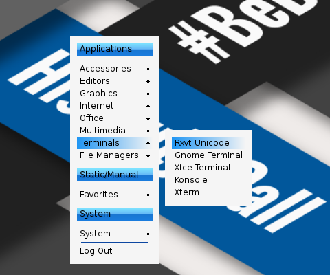
12: Menus
There are only few object in menus.
-
Title: black on blue300 to blue700, with blue900
-
Separator: blue900
-
Items: black on grey100, except grey500
-
Active Item: lack on blue500 to grey100, except grey500
This should be self explanatory.
!! black on blue300 to blue700, with blue900
menu.title.bg: Flat Gradient SplitVertical
menu.title.bg.color: #64b5f6
menu.title.bg.colorTo: #1976d2
!! menu.title.bg.border.color: #0d47a1
menu.title.text.color: #000000
menu.title.text.justify: Left

!! blue900
menu.separator.color: #0d47a1
menu.separator.width: 1
menu.separator.padding.width: 6
menu.separator.padding.height: 3

!! black on grey100, except grey500
menu.items.bg: Flat Solid
menu.items.bg.color: #f5f5f5
menu.items.text.color: #000000
menu.items.disabled.text.color: #9e9e9e

!! black on blue500 to grey100, except grey500
menu.items.active.bg: Flat Gradient Horizontal
menu.items.active.bg.color: #2196f3
menu.items.active.bg.colorTo: #f5f5f5
menu.items.active.text.color: #000000
menu.items.active.disabled.text.color: #9e9e9e
What’s Next
This is only the Theme Part, Consider continue reading [ Style Part ]