Preface
Tutor Four: PNG Fancy Icon
Table of Content
-
Preface: Table of Content
-
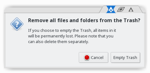
1: Preview
-
3: Border Layer
-
4: Button
-
5: Tabbed Theme
-
6: True Clone
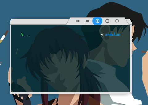
1: Preview
xftab Theme
Based On
This work, inspired by ArchEdgeUI. As my admiration, and respect, to his excellent taste in design.
My work is not as good as the original one. I avoid copyleft/copyright fraud. That’s why, I changed the icon looks.
2: Unified Graphic Material
This is the Inkscape Part.
Inkscape Document
SVG source available at:
Get the SVG
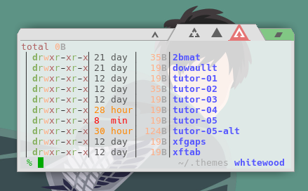
You may make from scratch or get my tutor-05-button.svg from my dotfiles repository at github.
Slices
Before you begin this the slices that we want to achieve.
Or alternatively
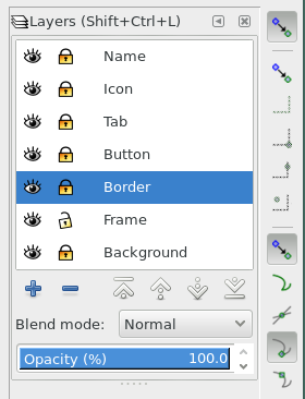
Layers
I utilize some more layers, we are going to build this step by step.
Size
We are using, only 5px border for this theme. Except, the top has 24px height.
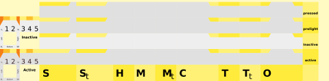
3: Border Layer
This is also the Inkscape Part.
Border related, and button background, placed in border layer.
Size and Color
We are using, only 5px border for this theme. Except, the top has 24px height. All the buttons also have 24px height. And the title only have 16px height.
Height:
-
bottom: 5px
-
top, button: 24px
-
title: 16px solid, plus 8px empty space above.
-
menu: no export
Width:
-
5px: left, right
-
32px: most box button has this size [hide, maximize, maximize-toggle, stick, stick-toggle].
-
56px: tab separator has this size [shade, shade-toggle, close]
Colors:
-
active: grey200 (#eeeeeeff)
-
inactive: grey400 (#e0e0e0ff)
You can easily turn this layer to XPM, if you want to.
4: Button
This is still also the Inkscape Part.
Specification
-
Size: W*H = 32px * 24px. most box button has this size [hide, maximize, maximize-toggle, stick, stick-toggle].
-
Size: W*H = 56px * 24px. tab separator has this size [shade, shade-toggle, close]
-
Colors: Using Google Material: Green. Except close button that use Red.
You may have different specification, to suit your needs.
Layout
We are going to make a uniform shape for each button.
Hence, any button layout is fine.
In my themerc, you can use O|TSHMC layout.
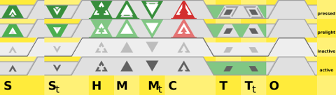
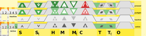
Details
There are four details, this is just one example, other button might have different size and color.
-
Active:
- layer icon: icon of 16 px width, with grey400 color

-
Inactive:
- layer icon: icon of 16 px width, with grey700 color

-
Prelight
-
layer icon: icon of 16 px width, with white and grey300 color
-
layer button: triangle icon of 32 px width with red300 color

-
-
Pressed, give a little animation.
-
layer icon: icon of 20 px width, with white and grey300 color
-
layer button: triangle icon of 32 px width with red700 color

-
Export
Hint: Use Inkscape’s Batch Export, to export all shapes at once.
This is a tricky part.
Consider set these layers before export:
-
Locked: icon, icon-border, button, border
-
Unlocked: Frame
-
Hide: name,background
Now the tricky part, for each border box parts.
We must select the box first in frame layer,
so we can have the export target filename such as bottom-left-active.png.
Then we have to hide the frame layer, because we want empty space as transparent.
The next thing to do is to click the export button to export PNG.
Unhide the frame layer, to select other box.
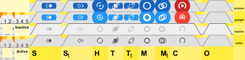
5: Tabbed Theme
This is the XFWM Part.
Configuration
This is the required themerc for this theme.
active_text_color=#444444
inactive_text_color=#888888

button_offset=2
button_spacing=0

full_width_title=true

maximized_offset=0
show_app_icon=false
shadow_delta_height=-6
shadow_delta_width=-10
shadow_delta_x=-12
shadow_delta_y=-12
shadow_opacity=100

title_horizontal_offset=1
title_shadow_active=false
title_shadow_inactive=under
title_vertical_offset_active=1
title_vertical_offset_inactive=1

button_layout=O|SHMCT
Title Font
Optionally, You may set font size 0 to hide title.
Result
Now, we already have our preview.
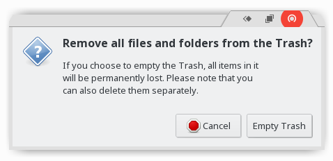
6: True Clone
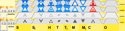
ArchEdgeUGM, based on ArchEdgeUI.
I also make this xftab clone theme, that is very similar with original ArchEdgeUI theme.
SVG Source
SVG source available at:
Slices
Preview
Dialog
Conclusion
After all, this all up to your imagination and creativity to create a goodlooking theme.
I think it is finished by now.
Thank you for reading.