Preface
Tutor Four: PNG Gradient over XPM
Table of Content
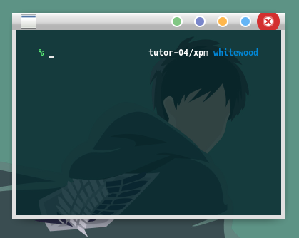
1: Preview
Screenshot of shaded window.

Based On
This work, inspired by xfwm-gaps. As my admiration, and respect, to his excellent taste in design.
2: Unified Graphic Material
This is the Inkscape Part.
Inkscape Document
SVG source available at:
Get the SVG
You may make from scratch or get my tutor-04-button.svg from my dotfiles repository at github.
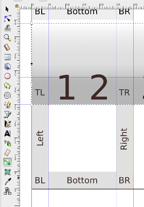
Slices
Before you begin this the slices that we want to achieve.
Layers
I utilize some more layers, we are going to build this step by step.
Size
We are using, only 5px border for this theme. Except, the top has 24px height.
3: Building the XPM
This is also the Inkscape Part.
Since we are going to use both XPM and PNG, first we should make our flat XPM.
Size and Color
We are using, only 5px border for this theme. Except, the top has 24px height. All the buttons also have 24px height.
Size:
-
left, right, bottom: 5px
-
top, title, button, menu: 24px
Colors:
-
active: grey200 (#eeeeeeff)
-
inactive: grey400 (#e0e0e0ff)
Create a new layer called XPM and make each boxes as below.
Export PNG
This is not a tricky part.
In general, to export the PNG, you must hide the name layer.
No need to hide the background layer, since no hollow
I mean all box area covered by solid color.
There is no tricky part here.
Just lock all layers, except frames.
Then each time you click any frame box,
it will show the target filename such as bottom-left-active.png.
Now, please export all necessary boxes. Each or using batch export.
Mogrify
Do not forget to convert to XPM using Mogrify. And also do not forget to delete all the PNG.
$ mogrify -format xpm *.png- .
Tips
Since we are going to concentrate on making PNG, you may put all the XPMs on other directory, and merge later after we’re done with all the PNGs.
4: Gradient and Highlight
This is still the Inkscape Part.
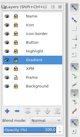
Layer
I utilize some more layers, such as this two
-
gradient
-
highlight
Border
Remember that, the top has 24px height.
On gradient layer, over the top border:
I put a box, 24 px height, filled with gradient with four handles as shown above.
-
Handle 0: rgba = (0, 0, 0, 80)
-
Handle 1: rgba = (0, 0, 0, 48)
-
Handle 2: rgba = (0, 0, 0, 24)
-
Handle 3: rgba = (0, 0, 0, 64)
On highlight layer, over the top border: 8px vertical offset of the previous box
I put a box, 16 px height, filled with gradient with two handles.
-
Handle 0: rgba = (255, 255, 255, 255)
-
Handle 1: rgba = (255, 255, 255, 40)
Neither gradient or highlight on inactive border. It is just simply flat.
Export
Now that we are done, we can batch export each PNG boxes and test the theme border.
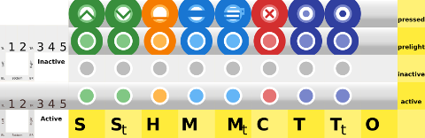
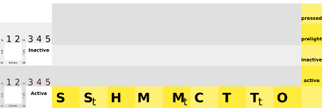
5: Button
This is still also the Inkscape Part.
Specification
-
Size: W*H = 32px * 24px. Each box button has this size.
-
Colors: Using Google Material: Red, Green , Blue, Orange, Indigo. Each box button has different color. Toggle button has the same color as its base button.
You may have different, to suit your needs.
Layout
We are going to make a uniform shape for each button.
Hence, any button layout is fine.
In my themerc, you can use O|TSHMC layout.
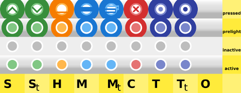
Details
There are four details, for each use the same spec as these below
-
Active:
-
layer icon: circle of 12 px radius with red300 color
-
layer icon-border: circle of 16 px radius with white color

-
-
Inactive:
-
layer icon: circle of 12 px radius with red300 color
-
layer icon-border: circle of 16 px radius with white color

-
-
Prelight
-
layer icon: circle of 12 px radius with red300 color
-
layer icon-border: circle of 16 px radius with white color
-
layer button: cut circle of 28 px radius with red700 color

-
-
Pressed, give an icon to solve usability issue.
-
layer icon: circle of 12 px radius with red300 color
-
layer icon-border: circle of 16 px radius with white color
-
layer button: cut circle of 32 px radius with red700 color
-
layer icon:
xshape with red900 color

-
Export
This is a tricky part.
Consider set these layers before export:
-
Locked: icon, icon-border, button, highlight, gradient
-
Unlocked: Frame
-
Hide: name, XPM, background
Now the tricky part, for each border box parts.
We must select the box first in frame layer,
so we can have the export target filename such as bottom-left-active.png.
Then we have to hide the frame layer, because we want empty space as transparent.
The next thing to do is to click the export button to export PNG.
Unhide the frame layer, to select other box.
6: Gradient Theme
This is the XFWM Part.
Configuration
This is the required themerc for this theme.
active_text_color=#444444
inactive_text_color=#888888

button_offset=2
button_spacing=0

full_width_title=true

maximized_offset=0
show_app_icon=true
shadow_delta_height=-6
shadow_delta_width=-10
shadow_delta_x=-12
shadow_delta_y=-12
shadow_opacity=100

title_horizontal_offset=1
title_shadow_active=false
title_shadow_inactive=under
title_vertical_offset_active=1
title_vertical_offset_inactive=1

button_layout=O|STHMC
Title Font
Optionally, You may set font size 0 to hide title.
XPM
You can use merge GTK color feature into XPM.
Consider this XPM.
/* XPM */
static char *bottom_active[] = {
/* columns rows colors chars-per-pixel */
"20 5 1 1 ",
"  c gray88",
/* pixels */
"                    ",
"                    ",
"                    ",
"                    ",
"                    "
};- .
Just search and replace from
" c gray88",to
" c gray88 s active_color_2",and respectively also search and replace from
" c #EEEEEE",to
" c #EEEEEE s inactive_color_2",Note that you can also utilize color_1,
instead of color_2, by search and replace.
XPM and PNG
Now, merge the XPM directory to xfwm4 directory, so the XPM and the PNG has the same directory.
Changing Color
You can change GTK Appearance from system setting.
You are done with GTK color.
7: Result
Now, we already have our preview.
Usability
The issue with minimalist color is that,
it is good in aestethic issue, but lack of functional aspect.
In order to solve this usability issue, I put functional icon on keypressed,
such as the x icon for close.
So that user won’t click the wrong button.
What’s Next
Tutor Five, PNG Fancy Icon. Consider finish reading [ Part Five ].