Preface
Tutor Three: Flat Design, Minimalist PNG Button
Table of Content
-
Preface: Table of Content
1: Unified Graphic Material
This is the Inkscape Part.
Inkscape Document
SVG source available at:
Get the SVG
You may make from scratch or get my tutor-03-button.svg from my dotfiles repository at github.
Slices
Before you begin this the slices that we want to achieve.
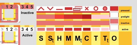
Border
I won’t give much explanation. We’re already have border tutorial in previous article.
We are using 10px border for this theme. Additionaly, the top has 14px height. 10px solid, with additional 4px empty space.
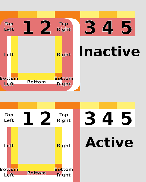
Just export each PNG boxes and test the theme border.
Button
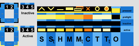
There are some window buttons, in my themerc, my layout is:
button_layout=O|TSHMCLet me explain with my own window understanding, or better, with target save button
-
S : shade
-
St : shade-toggled
-
H : hide
-
M : maximize
-
Mt : maximize-toggled (restore)
-
C : close
-
T : stick
-
Tt : stick-toggled
-
O : menu
Each button has states:
-
active
-
inactive
-
prelight (hover)
-
pressed
So we can have a complete button name, for example for close button such as
-
close-active.png
-
close-inactive.png
-
close-prelight.png
-
close-pressed.png
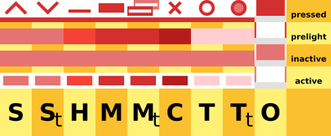
Note that border only have two states [active, inactive], and do not have the other two state [prelight, pressed].
Detail
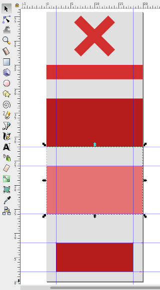
Each box button has the size of [W*H = 20px * 14px]. You can clone my example, or you have your own creation.
I’m using goggle material color: red100, red300, red500, red700, red900. You can use other color as well such as: blue100, blue300, blue500, blue700, blue900. Or other color combination, as you desire.
2: Minimalist Theme
This is the XFWM Part.
Result
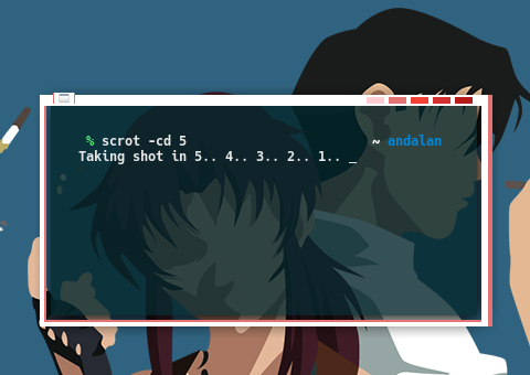
Now, we already have our preview.
Usability
The issue with minimalist color is that,
it is good in aestethic issue, but lack of functional aspect.
In order to solve this usability issue, I put functional icon on keypressed,
such as the x icon for close.
So that user won’t click the wrong button.

3: 2bmat Minimalist Theme
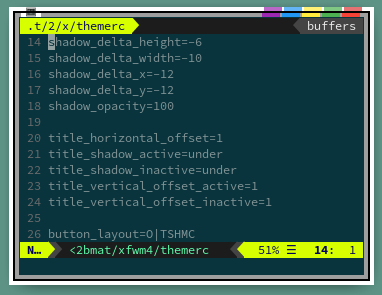
For my own exercise , I make this 2bmat minimalist theme.
SVG Source
SVG source available at:
Slices

Preview
4: xfgaps Minimalist Theme
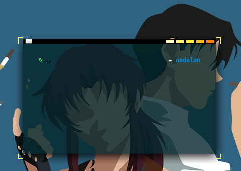
I also make this xfgaps minimalist theme, that is very suitable for tiling.
SVG Source
SVG source available at:
Slices
Preview
What’s Next
Tutor Four, PNG Gradient over XPM. Making a more serious theme. Consider finish reading [ Part Four ].