Hello There,
I have finally made it, a desktop ricing with my own original wallpaper.
This article show a rather complete desktop ricing. From original geeky-art wallpaper made in inkscape. It continued with original complex conky statusbar, implemented in i3 tiling window manager. And last, a Manjaro Logo creation using only Terminal. I skip all the terminal text ricings to keep its simple looks.
So simple but, we all n00b once, right!
Sitting Here
I’ve been sitting here thinking how people working and making achievement.
I’m still sitting here thinking, while people working.
I’m still thinking, while people making achievement.
People working, and I’m still thinking.
The Material Wallpaper
Tonight, I feel so “I have no life.” So I made a lame wallpaper with inkscape today. A wallpaper clone of inpired by Material, with Isometric Experiment for myself. I know I looks dumb. Like usual.
Influence
My Works inspired by
-
http://dakoder.deviantart.com/art/MinFlat-Dark-Material-Design-Wallpaper-4K-509845098
-
https://www.whatswithtech.com/cool-and-best-material-design-wallpaper-hd-for-windows-7-8-and-10/
Preview
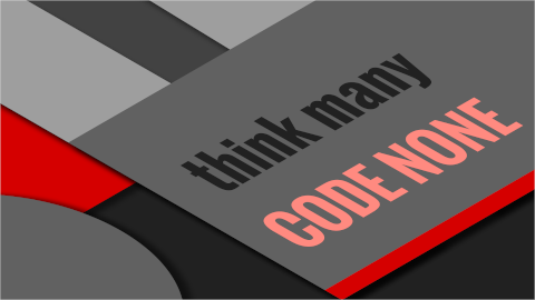
This is what I’ve got so far. Please Click for higher resolution.
Each Layer contain different color scheme. So the svg source has more than just this Grey with Red accent. The text is using Oswald Font. You can change the text to suite your message.
Inkscape
Yes, it is an inkscape document.
Additionaly further than Material Design, I added an Isometric looks. Just because I can.
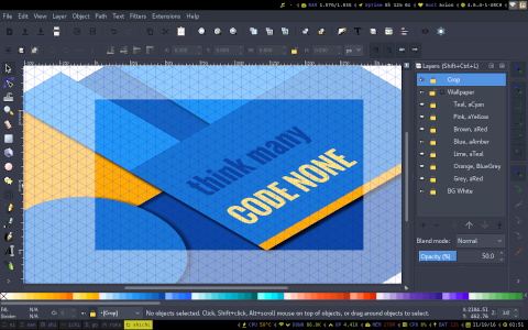
First, I have made an axonometric grid. This will create an isometric looks document.
-
Spacing Y: 8, and changed later to 2, or 4 or 8
-
Angle X: 30
-
Angle Z: 30
-
Major Grid Every 10
Please Click for higher resolution.
You can examine:
-
Left: Layers for some color theme
-
Bottom: Google Material Pallete Colors.
-
Top: Menu: Just kidding …
SVG Source
The Tiling Window Manager
Manjaro Logo
After a while I decide to have a try in i3. Then suddenly I realize how easy it is, to make a Manjaro logo with only terminals in i3.
But unfortunately, it looks so lame. Now I feel a little bad for it. #embarassing
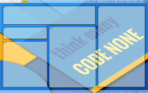
Bright on Blue
Please Click for higher resolution.
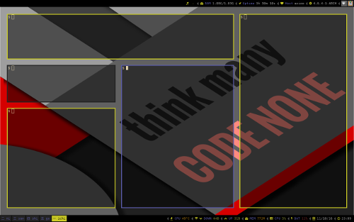
Dark on Grey
Please Click for higher resolution.
Dotfiles Source
You can check my dotfiles here. And I also put some i3 related articles in this blog.
DeviantArt
Desktop Ricing would not be complete without your original wallpaper.
What do you think ?


